

Your mobile app is live, users are downloading it — but engagement is slipping, support tickets are climbing, and your conversion funnel leaks at every step. Sound familiar? The problem usually isn't your features. It's your experience layer.
In this playbook, we walk through a proven process for auditing, redesigning, and iterating on the UX and UI of an existing mobile application — the same methodology our team at MEDL Mobile has refined over 15+ years of building award-winning digital products in Southern California.
Why UX/UI Improvements Can't Wait
The data is unambiguous: neglecting user experience actively costs revenue. For every dollar invested in enhancing UX, businesses can expect a return of $100 — a staggering 9,900% ROI. Conversely, 88% of online users say they will not return after a poor experience, and 38% will disengage from a poorly designed mobile app entirely.
Statistics also show that 25% of mobile apps are used only once, while 24% of Android apps are uninstalled within a single day of download. These aren't hypothetical risks; they're measurable realities that directly erode your customer acquisition spend.
The competitive bar has also risen. In 2026, user expectations continue to climb — users want apps that feel effortless, adapt to their needs, and respect their time, attention, and privacy. If your app was designed two or three years ago without subsequent UX iteration, it's almost certainly showing its age.
Step 1 — Diagnose Before You Design
The single biggest mistake product teams make is jumping to visual changes before understanding root causes. Most apps look polished but don't actually guide user intent. Without behavioral UX analysis, users get stuck at onboarding, forms, or navigation — resulting in early churn and wasted acquisition spend.
What to Examine First
- Quantitative signals: Track Daily Active Users (DAU), Monthly Active Users (MAU), session duration, uninstall rates, and funnel drop-off points. A decline in any of these metrics often reveals UX issues before teams recognize them in design reviews.
- Qualitative feedback: Collect input through app store reviews, in-app surveys, and support tickets. These surface the why behind the numbers.
- Behavioral analytics: Use heatmaps and session replay tools to see exactly where users tap, swipe, scroll, and spend time. If users aren't clicking a particular button, that's a signal to redesign or relocate it.
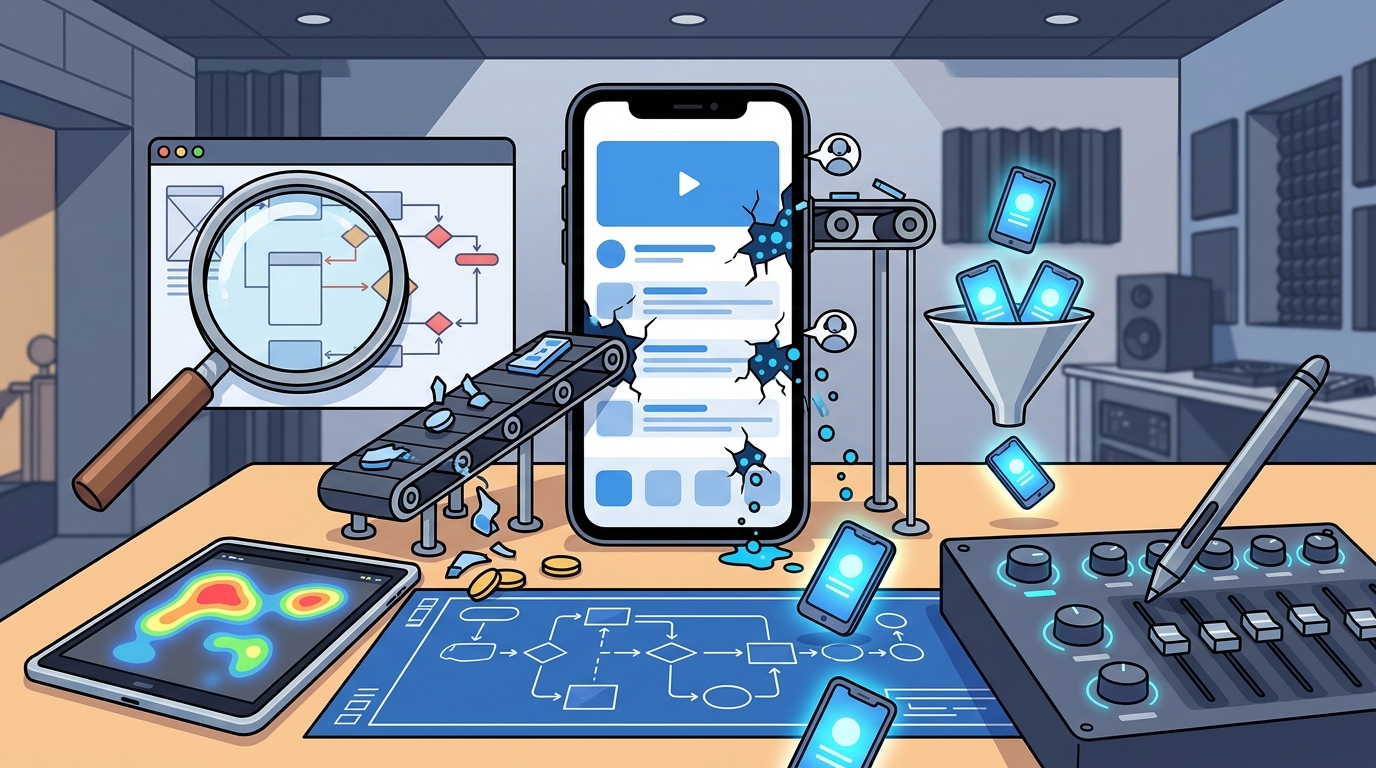
Step 2 — Conduct a Comprehensive UX Audit
A UX audit is a structured evaluation of every major screen and user flow in your app. At MEDL Mobile, we typically cover:
- Task-flow analysis — Map the steps required for each core action (sign-up, purchase, search, share). Count taps, screens, and decision points.
- Heuristic evaluation — Measure the app against established usability principles: visibility of system status, consistency, error prevention, recognition over recall, and flexibility.
- Competitive benchmarking — Compare interaction patterns with leading apps in your category. Are you requiring three screens where competitors need one?
- Platform guideline review — Verify compliance with Apple's Human Interface Guidelines and Google's Material Design standards. Deviating from platform conventions increases cognitive load.
- Performance profiling — Screen load time, animation frame rates, and API response times all affect perceived UX. Walmart's research found a 2% increase in conversions for every second of improvement in loading time.
Step 3 — Prioritize Changes by Impact
Not every UX issue warrants immediate attention. Use an impact-effort matrix to categorize findings:
| Category | Impact | Effort | Action |
|---|---|---|---|
| Quick wins | High | Low | Ship in the next sprint |
| Strategic projects | High | High | Plan for next quarter |
| Fill-ins | Low | Low | Bundle with other releases |
| Deprioritize | Low | High | Revisit later or drop |
Common quick wins include fixing button contrast ratios, reducing form field counts, adding loading indicators, and adjusting touch-target sizes to meet the recommended 44×44pt minimum.
Step 4 — Modernize Your Visual UI Layer
Visual design shapes perception within milliseconds. If your interface feels clunky, outdated, or overloaded, users won't give it a second chance — they'll uninstall and move on to one of the countless alternatives available.
2026 Visual UI Principles
- Restraint over decoration: User-first design in 2026 means removing anything that does not directly help the user. Screens should be calmer, layouts more focused, and visual hierarchy clearer.
- Intentional depth: Techniques like glassmorphism and neumorphism can add sophistication, but they must be balanced with readability.
- Consistent design tokens: Adopt a design system with reusable color, typography, spacing, and component tokens. This ensures visual consistency across every screen and reduces design debt.
- Dark mode as standard: Dark mode remains popular thanks to reduced eye strain, better battery performance on OLED displays, and a modern aesthetic users now expect.
Step 6 — Rebuild the Onboarding Experience
Onboarding is the starting point of users' journey with your app. An inadequate onboarding experience is a common issue that can dampen your mobile app experience. If you're facing short-term retention issues, reevaluating your onboarding flows should be a top priority.
What Effective Onboarding Looks Like
- Value-first, permissions-second: Let users experience core value before requesting location, notification, or camera access. Contextual permission prompts convert at 2–3× the rate of upfront requests.
- Progressive profiling: Instead of a lengthy registration form, collect information incrementally as users interact with features.
- Interactive walkthroughs: Replace static tutorial carousels with guided actions — let users complete a real task during onboarding so they immediately see the app's benefit.
- Skip option always visible: Forcing users through onboarding screens breeds resentment. Always provide a clear way to bypass.
Step 7 — Embed Accessibility From the Ground Up
Accessibility features like dark mode, color contrast, text resizing, and voice support are no longer "nice-to-have" — they're standard expectations in modern app design. Beyond compliance with WCAG 2.2 guidelines, accessibility improvements benefit all users:
- Color contrast ratios: Maintain a minimum 4.5:1 ratio for body text and 3:1 for large text and UI components.
- Dynamic type support: Respect system-level font-size preferences on both iOS and Android.
- Screen reader labels: Every interactive element needs a meaningful accessibility label — not just "button" or "image."
- Reduce motion option: Provide alternatives to animations for users who experience motion sensitivity.
- Keyboard and switch navigation: Ensure every function is operable without touch for users relying on assistive devices.
Step 8 — Leverage AI for Personalization
AI personalization uses machine learning to adjust content, layout, and recommended actions for each user. In 2026, the design trend has shifted toward adaptive flows, AI prediction, fewer decisions per screen, and instant feedback — changes that directly reduce churn and accelerate activation.
Practical AI-Driven UX Enhancements
- Smart defaults: Pre-fill forms and settings based on user history and behavioral patterns.
- Adaptive content ordering: Surface the features and content most relevant to each user segment rather than displaying a one-size-fits-all home screen.
- Conversational interfaces: AI chatbots powered by natural language processing can handle multiple conversations simultaneously, saving time and improving customer engagement.
- Predictive search: Suggest queries and results before the user finishes typing, reducing friction in discovery-heavy apps.
At MEDL Mobile, we integrate AI and machine-learning capabilities directly into our clients' apps, ensuring that personalization feels natural rather than intrusive.
Step 9 — Test, Measure, Iterate
Every UX improvement answers the same underlying question: what is making this harder than it needs to be? The impact of any single change is site-specific, so it should always be confirmed with an A/B test.
Your Testing Toolkit
- A/B testing: Run controlled experiments on specific elements — button color, CTA copy, layout variations — and let statistically significant results guide decisions.
- Usability testing: Conduct moderated sessions with 5–8 representative users per round. This uncovers friction before development, saving significant redesign costs.
- Session replay analysis: Watch real user sessions to identify rage taps, dead clicks, and navigation loops that quantitative data alone can't explain.
- Post-release monitoring: Track your KPI dashboard for at least two full release cycles after deploying changes. Look for movement in retention, session duration, and task-completion rates.
Regular updates ensure the app remains functional, engaging, and aligned with evolving user expectations. UX improvement is not a one-time project — it's a continuous discipline.
When to Bring In a Design Partner
When the core architecture of the experience no longer supports new features or evolving user needs, incremental updates start to feel like temporary fixes rather than lasting solutions. At this stage, a holistic redesign allows teams to rethink flows, prioritize features properly, and create a more scalable experience system.
Choosing the right UI/UX design partner matters. A capable mobile UX partner should demonstrate both strategic depth and executional excellence — not just aesthetic polish. The right partner influences how users experience your brand, how easily they complete key actions, and how well your app adapts to future needs.
MEDL Mobile brings over 15 years of experience delivering award-winning mobile apps, AI solutions, and AR/VR experiences from our base in Southern California. Whether you need a targeted UX audit or a full-scale redesign, our team combines user research, behavioral analytics, and design-system thinking to produce measurable improvements in engagement and retention.
Key Takeaways
- Always diagnose with data before redesigning with aesthetics — track DAU, MAU, session duration, and funnel drop-offs first.
- A structured UX audit covering task flows, heuristics, competitive benchmarks, and platform guidelines is the foundation of every successful redesign.
- Prioritize by impact and effort: quick wins like contrast fixes and form simplification deliver outsized returns.
- Modern UI in 2026 is defined by restraint, accessibility, and dark mode — not decoration.
- Rebuild onboarding to deliver value before requesting permissions.
- Use AI personalization to create adaptive, user-specific experiences that reduce churn.
- Test every change with A/B experiments and usability sessions; UX improvement is continuous.
- When incremental fixes aren't enough, partner with an experienced digital product agency like MEDL Mobile for a holistic redesign.
Frequently Asked Questions
What is the ROI of improving mobile app UX?
For every dollar invested in enhancing UX, businesses can expect a return of approximately $100 — a 9,900% ROI. Additionally, a good user interface redesign can increase conversion rates by up to 200%. These figures make UX one of the highest-returning investments a product team can make.
How do I know if my existing app needs a UX overhaul vs. minor tweaks?
If your quantitative metrics — retention, session duration, or conversion rates — are declining despite stable traffic, and usability compromises have stacked up over multiple releases, the experience architecture itself may need rethinking. Minor tweaks work when issues are localized; a redesign is warranted when the overall flow no longer supports evolving user needs.
How long does a mobile app UX redesign take?
Timelines vary by complexity and research depth, but a typical UX/UI redesign process takes 4–10 weeks. This includes research, audit, wireframing, visual design, prototyping, and usability testing before any code is written.
What tools are commonly used for mobile UX analysis?
Popular tools include Figma and Sketch for design, UXCam and Hotjar for heatmaps and session replay, Maze for usability testing, and Firebase or Mixpanel for quantitative analytics. The choice depends on your platform (iOS, Android, or cross-platform) and team workflow.
Should I follow iOS and Android design guidelines separately?
Yes. Apple's Human Interface Guidelines and Google's Material Design standards each define platform-specific patterns users expect. Deviating from these conventions increases cognitive load and can make your app feel foreign on either platform. A skilled agency like MEDL Mobile ensures platform-native design while maintaining brand consistency.
How does AI improve mobile app UX in 2026?
AI enables adaptive flows that adjust content, navigation, and recommendations per user. Key applications include predictive search, smart form defaults, conversational chatbot interfaces, and dynamic content ordering — all of which reduce decision fatigue and accelerate time-to-value.