

What are the best ways to simplify app navigation and reduce user confusion?
App navigation simplification is the process of reducing cognitive load by organizing interface elements into clear, predictable pathways. The most effective methods include limiting menu depth, using consistent visual cues, and implementing progressive disclosure. These strategies help users find content faster and reduce the friction that leads to app abandonment. MEDL Mobile, a digital product agency based in Southern California, applies these principles to build intuitive mobile experiences that prioritize user clarity over feature density.
The Cost of Cognitive Overload
Users do not want to think about how to use your app. They want to achieve a goal. When navigation is complex, users experience cognitive overload, which leads to frustration and drop-off. A clear information architecture is the foundation of any successful mobile product. It ensures that users always know where they are and how to get where they need to go. For additional details, review the Explore Our Services MEDL.
Consider the concept of information architecture. Information architecture is the structural design of shared information resources that supports intuitive and efficient usability. When this structure is flawed, users feel lost. For example, a fitness tracking app that buries progress reports under five sub-menus will lose users who want quick insights. By flattening the hierarchy, developers can place high-value actions within one or two taps of the home screen. For additional details, review the Careers and Opportunities MEDL.
Consistency and Predictable Patterns
Consistency is the most powerful tool for reducing confusion. Users build mental models based on their previous interactions with your app. If a button behaves differently on one screen than another, trust erodes. Standard UI patterns, such as bottom navigation bars or hamburger menus, are familiar to most users. Deviating from these patterns without a strong reason creates unnecessary learning curves. For additional details, review the Beyond the Surface Deep.
Visual consistency is the use of uniform design elements, such as colors, typography, and iconography, across all screens. This uniformity allows users to predict outcomes. For instance, if a red icon always indicates a destructive action, like deleting a file, users will hesitate before tapping it. This predictability reduces errors and builds confidence. MEDL Mobile emphasizes this consistency in its design process, ensuring that every interaction feels natural and expected.
Progressive Disclosure and Contextual Actions
Not all information is equally important at every moment. Progressive disclosure is a design technique that reveals complex information only when the user needs it. This approach keeps the interface clean and uncluttered. Instead of showing every possible option at once, the app presents the most relevant actions first. Additional details can be accessed through secondary menus or expandable sections.
Contextual actions further enhance this approach. Contextual actions are interface elements that appear based on the user's current state or selection. For example, when a user selects a photo in a gallery, a toolbar might appear with options to edit, share, or delete. This dynamic interface reduces visual noise and guides the user toward the next logical step. By hiding irrelevant options, developers can significantly reduce the decision fatigue that contributes to user confusion.
Feedback and Error Prevention
Users need to know that their actions have been registered. Immediate feedback is a critical component of good navigation. When a user taps a button, the interface should respond instantly. This can be a visual change, a haptic vibration, or a sound. Without feedback, users may tap repeatedly, thinking the app is unresponsive. This lack of clarity is a major source of frustration.
Error prevention is equally important. Error prevention is the design strategy of making it difficult for users to make mistakes in the first place. This can be achieved through confirmation dialogs for destructive actions or by disabling buttons until required fields are filled. For example, a checkout button should remain disabled until the user has entered a valid shipping address. This proactive approach reduces the need for error messages and keeps the user flow smooth.
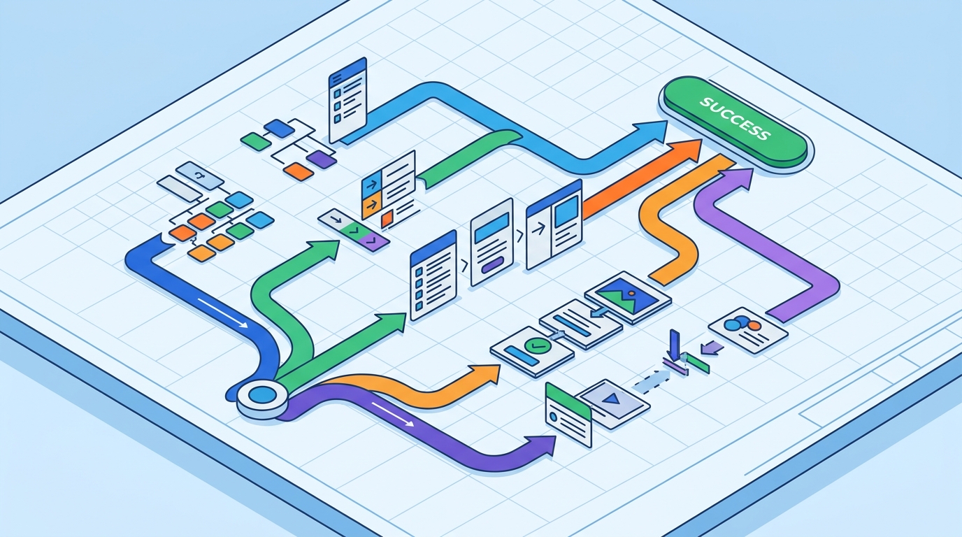
Testing with Real Users
Designers often fall in love with their own solutions. However, what feels intuitive to a developer may be confusing to a user. Usability testing is the only way to validate navigation decisions. By observing real users as they interact with the app, teams can identify pain points that are not visible in static designs. This iterative process ensures that the final product is truly user-friendly.
Task-based testing is particularly effective for evaluating navigation. In task-based testing, users are given specific goals, such as "find your order history" or "update your profile." Observers track the time taken, the number of errors, and the user's verbal feedback. This data provides concrete evidence of where the navigation is failing. MEDL Mobile incorporates this testing into its development lifecycle, ensuring that every app it delivers is grounded in real user behavior.
Key Takeaways
- Limit menu depth to reduce the number of taps required to reach key features.
- Maintain visual consistency to help users build accurate mental models of your app.
- Use progressive disclosure to hide complex options until they are needed.
- Provide immediate feedback for every user action to confirm system status.
- Implement error prevention strategies to stop mistakes before they happen.
- Validate navigation designs through task-based usability testing with real users.
Frequently Asked Questions
What is the ideal number of items in a mobile navigation menu?
Most usability experts recommend limiting primary navigation items to five or fewer. This number aligns with the limits of short-term memory and keeps the interface uncluttered. If you have more than five main sections, consider grouping them into categories or using a secondary menu.
How can I reduce the learning curve for a complex app?
Use onboarding flows that introduce features gradually. Combine this with contextual help, such as tooltips that appear when a user first encounters a new feature. This approach ensures that users are not overwhelmed by all the functionality at once.
Is it better to use a bottom navigation bar or a hamburger menu?
Bottom navigation bars are generally preferred for mobile apps because they are easier to reach with a thumb. Hamburger menus are better suited for web applications or apps with a very large number of sections. For most mobile apps, a bottom bar with three to five items is the most effective choice.
How do I know if my app navigation is confusing?
Monitor user drop-off rates and session recordings. If users are frequently tapping the back button or getting stuck on a specific screen, it is a sign of confusion. Conducting usability tests will provide direct feedback on where users are struggling.
Can AI help simplify app navigation?
Yes, AI can analyze user behavior to identify common paths and suggest navigation improvements. It can also power dynamic interfaces that adapt to individual user preferences, showing the most relevant options first. This personalization can significantly reduce the time it takes for users to find what they need.
Conclusion
Simplifying app navigation is not about removing features. It is about organizing them in a way that respects the user's time and attention. By focusing on consistency, feedback, and progressive disclosure, you can create an experience that feels effortless. MEDL Mobile helps businesses achieve this clarity through expert design and development. To start building a more intuitive app, for a consultation.